How to write newsletter HTML code for Outlook and other email clients?
In this post, I would like to show you how I created a newsletter HTML code that will display correctly in all mail clients, including Outlook. Thanks to this tutorial you will be able to write any HTML template for the content of your mailing yourself.
In the previous article I described how the mailing works from the technical side and I showed how to create the graphic design of the newsletter. I invite you to read it:
How to create a responsive newsletter for all email clients? (click)
How to write newsletter HTML code for Outlook?
Creating code under Newsletter is not easy and I wrote about it in a previous article. Most email clients are moving with the times and updating their email application software so that it correctly reads today’s HTML messages. Unfortunately, not everyone is moving with the times and updating their software with new HTML or CSS trends. Microsoft and their Outlook application is proving to be problematic.
Outlook has the biggest problems with reading many popular CSS styles (e.g. border-radius, rounded edges) and structures like div. It is true that it reads the <div> tag, but it does not work well with this structure and there are often problems. Moreover some things will work on one version of outlook on another and it depends on version of application. This forces the programmer to do a lot of extra work when writing code and testing it. So how to create it properly?
The best way is to test it on the fly. We are not able to check every functionality, code, style if it is supported in a given application or not. That’s why it’s best to send ready elements on the fly when creating a newsletter view and check how they are displayed in particular mail clients. A newsletter sent on email applications may have a completely different appearance than in the case of a browser view. Only after the message has been sent will it become clear how the newsletter looks as an email message in the respective email client and app.
The newsletter must be written simply – preferably using tables, and the styles are to be uncluttered and basic functionality should be used. This will ensure that we come close to the correct look on most mail clients.
Table in HTML – what is it and how to use it?
A table in HTML is a structure that allows us to position content in a view. As with any table, we have to deal with rows and columns. Inside the table we can arrange elements in horizontal and vertical positions.
Why use a table for newsletters?
Positioning the content in the view using tables gives us a guarantee that any browser, application or device will read it correctly. In the case of views based on a div structure, the situation looks different in the case of mailing. We may risk using divs in the case of a newsletter and the majority of mail clients will read this structure, but when it comes to styles written for divs, unfortunately they may not work properly.
Attempts to create layouts using divs ended up with crashed layouts in case of microsoft (outlook) mailboxes.
How to use tables?
It is really simple. Admittedly it is much more time consuming than using regular div tags, because instead of one <div></div> we have to use 3 tags:
1 2 3 4 5 | <table> <tr> <td></td> </tr> </table> |
- <table></table> – the table tag is a table tag and must have rows and columns inside,
- <tr></tr> – table row,
- <td></td> – column of the table.
Of course, beyond this simple layout there are many more tags or table values that we could use. These are tags such as <thead> corresponding to the table header or <tfoot> corresponding to the table footer. Besides, there are functions such as column merging, etc. etc. But the question is do we need all this? Not necessarily. Most of the views can be created using a simple construction of nested tables .
What are nested tables?
We create inside the main table further tables corresponding to the next elements of our view (if necessary of course).
Outlook conditional CSS – displaying only in Outlook
Sometimes it happens that our newsletter is displayed correctly on all kinds of mail clients, but some element is impossible to process on Outlook applications. Then we can use a condition to add a certain element or style only for Outlook client.
Example of the condition:
1 2 3 4 5 | <!--[if mso]> <table><tr><td> /* Outlook-specific HTML content goes here. */ </td></tr></table> <![endif]--> |
In this condition we see how outlook conditional CSS works. First we check if the current client is an outlook client – [if mso]. If so, we add a table in which we can place the content to be displayed only for Outlook.
We can do the same with the style, which can only apply to Outlook:
1 2 3 4 5 6 7 | <!--[if mso]> <style> .example-class { /* Outlook-specific CSS goes here. */ } </style> <![endif]--> |
Enough theory, let’s move on to practice 🙂
Creating HTML code adapted for e-mailing
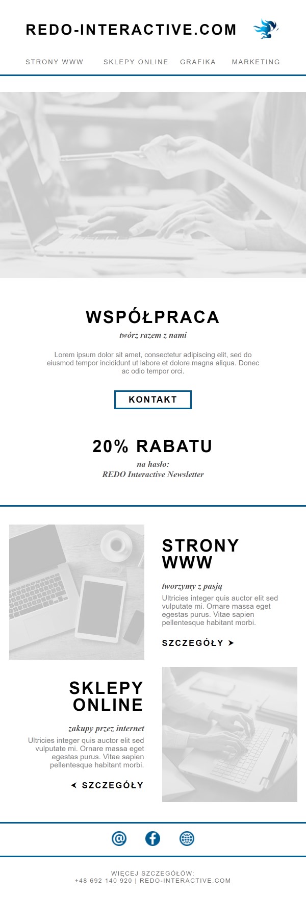
In an earlier post we created the graphic design and wrote the code for the newsletter. Now it’s time to discuss how we created this code. As a reminder I will insert how our finished newsletter looks like:
Establishment of a Newsletter project
Internet mails are developing more and more and thus the technology in them is more and more up to date. This allows us to use the correct HTML structure in messages. In the past mailboxes automatically cut off head section and you had to use inline-styles to style elements. Today we can easily use html structure with head body and styles in head.
I am pasting the structure of empty newsletter project, which I have already shown in previous article:
1 2 3 4 5 6 7 8 9 10 11 12 13 14 15 16 17 18 19 20 21 | <!DOCTYPE html> <html lang="pl"> <head> <meta http-equiv="Content-Type" content="text/html; charset=UTF-8" /> <meta name="viewport" content="width=device-width, initial-scale=1" /> <meta http-equiv="X-UA-Compatible" content="IE=edge" /> <title>REDO Interactive Newsletter</title> <style type="text/css"> /* STYLES HERE */ </style> </head> <body style="margin: 0; padding: 0; background-color: #ffffff"> <center> <table width="600" border="0" cellpadding="0" cellspacing="0"> <tr> <td align="center" valign="top"></td> </tr> </table> </center> </body> </html> |
As you can see this is a basic template for HTML and there are no surprises here. There is a specified DOCTYPE, we have an html tag, inside a head section with meta tags, title and style. Inside is a body tag which has the margins and padding reset. Then we have a center tag to center our master table view.
The main table has its width permanently fixed at 600px width. It has the border, cellpadding and cellspacing values reset so that it displays correctly (in some cases there are certain values set in advance for these attributes and it is a good idea to set them to 0 and set a value if necessary).
Create Newsletter header
Our newsletter consists of a main header next to which on the right side there is a logo. Underneath there are 4 tabs referring to the corresponding pages of our website redo-interactive.com. The header code is as follows:
1 2 3 4 5 6 7 8 9 10 11 12 13 14 15 16 17 18 19 20 21 22 23 24 25 26 27 28 29 30 31 32 33 34 35 36 37 38 39 40 41 42 43 44 45 46 47 48 49 50 51 52 53 54 55 56 57 58 59 60 61 62 63 64 65 66 67 68 69 70 71 | <table width="500" border="0" cellpadding="0" cellspacing="0" style="margin: auto; padding: 35px 0 15px 0" > <tr> <td> <h1> <a href="https://redo-interactive.com/" target="_blank" >redo-interactive.com</a > </h1> </td> <td> <a href="https://redo-interactive.com/" target="_blank" ><img height="44" width="auto" src="https://redo-interactive.com/assets/uploads/2021/04/nl-logo.png" /></a> </td> </tr> </table> <table width="500" border="0" cellpadding="0" cellspacing="0" style="margin: auto; padding: 15px 0" > <tr> <td width="auto"> <h3> <a href="https://redo-interactive.com/strony-internetowe/" target="_blank" >Strony WWW</a > </h3> </td> <td width="auto"> <h3 style="text-align: center"> <a href="https://redo-interactive.com/sklepy-internetowe/" target="_blank" >Sklepy Online</a > </h3> </td> <td width="auto"> <h3 style="text-align: center"> <a href="https://redo-interactive.com/projekty-graficzne/" target="_blank" >Grafika</a > </h3> </td> <td width="auto"> <h3 style="text-align: right"> <a href="https://redo-interactive.com/identyfikacja-wizualna/" target="_blank" >Marketing</a > </h3> </td> </tr> </table> |
We create two separate tables for the main header and tabs. We set the tables to be 500px wide. Then in inline-styles we add margin: auto so that the margins automatically adjust and display the tables in the middle of the main table. We also add appropriate padding to our tables.
In the header table we create two columns one for the header the other for the logo. We link both the header and logo to the main page by adding the <a href=”” target=”_blank”> tag. In the case of the main header, we give the header the highest h1 value. We will later sharpen it to make it look as close to the mockup view as possible. We insert the image of the logo in the <img src=””/> tag and set the height of the image we want to get and the width to auto fit.
We divide the next tab table into 4 columns <td> and in each column we give our tabs as h3 and link them with the <a> tag. Apart from that we need to set the position of the text display. The left side column should stick to the left edge. The right column to the right, and the middle column to the centre. Column widths are set to auto to fit the text.
Image section
The section with the main image of our newsletter has a top border separating the top header from the rest of the content. Apart from that, it is enough to add an appropriate padding and link the image.
1 2 3 4 5 6 7 8 9 10 11 12 13 14 15 16 17 | <table width="600" border="0" cellpadding="0" cellspacing="0"> <tr> <td style=" padding: 30px 0 50px 0; border-top: 3.5px solid #005b90; " > <a href="https://redo-interactive.com/" target="_blank" ><img height="365" width="100%" src="https://redo-interactive.com/assets/uploads/2021/04/nl-banner.png" /></a> </td> </tr> </table> |
Main content – invitation to cooperation
It’s time for some text. We’ll leave the text styling for last, where I’ll show you how I added styles for the headlines and other text found in the newsletter. The content itself is added similarly to the sections with the main headline and image. That is, we create tables and insert the content accordingly and link to the relevant pages.
1 2 3 4 5 6 7 8 9 10 11 12 13 14 15 16 17 18 19 20 21 22 23 24 25 26 27 28 29 30 31 32 33 34 35 36 37 38 39 40 41 42 43 44 45 46 47 48 49 50 51 | <table width="600" border="0" cellpadding="0" cellspacing="0"> <tr> <td style="text-align: center; padding-bottom: 2px"> <h2> <a href="https://redo-interactive.com/strona-glowna/#contact" target="_blank" >Współpraca</a > </h2> </td> </tr> <tr> <td style="text-align: center; padding-bottom: 20px"> <p class="italic">twórz razem z nami</p> </td> </tr> <tr> <td style="text-align: center; padding-bottom: 30px"> <p style="margin: auto; width: 420px"> Lorem ipsum dolor sit amet, consectetur adipiscing elit, sed do eiusmod tempor incididunt ut labore et dolore magna aliqua. Donec ac odio tempor orci. </p> </td> </tr> <tr> <td style="text-align: center; padding-bottom: 50px"> <a class="cta-btn" href="https://redo-interactive.com/strona-glowna/#contact" target="_blank" >Kontakt</a > </td> </tr> </table> <table width="600" border="0" cellpadding="0" cellspacing="0"> <tr> <td style="text-align: center; padding-bottom: 2px"> <h2>20% rabatu</h2> </td> </tr> <tr> <td style="text-align: center; padding-bottom: 50px"> <p class="italic"> na hasło:<br />REDO Interactive Newsletter </p> </td> </tr> </table> |
We centre the text in the relevant columns using text-align: centre and set the appropriate padding.
Additionally, the italic class has appeared. This class is responsible for italic text and is located in styles in the head section. It will be added to texts with italic fonts in our newsletter.
We also add the cta-btn class to the <a> tag corresponding to the Contact button of our newsletter. The cta-btn class will ostilize our link into the form of a button.
Advertising section with images
The next section is a little more elaborate. It contains images and text that change their position in two lines. This section also has a top border separating the section.
We create the main table of our section and add two rows. In each row, we add two columns set to 50% of the width of the main table. Additionally, we give padding for each column so that they do not touch each other and do not stick to the edges.
In the first row of the table in the first column, we add an image with a link in the form of a 265x265px square. An image of the same dimensions is added in the second row in the second column.
In the second column of the first row, we add another table with advertising content. The same shall be added in the first column of the second row.
The advertising content, depending on the row, is positioned to the right or to the left using text-align: left, text-align: right.
1 2 3 4 5 6 7 8 9 10 11 12 13 14 15 16 17 18 19 20 21 22 23 24 25 26 27 28 29 30 31 32 33 34 35 36 37 38 39 40 41 42 43 44 45 46 47 48 49 50 51 52 53 54 55 56 57 58 59 60 61 62 63 64 65 66 67 68 69 70 71 72 73 74 75 76 77 78 79 80 81 82 83 84 85 86 87 88 89 90 91 92 93 94 95 96 97 98 99 100 101 102 103 104 105 106 107 108 109 110 111 112 113 114 115 116 117 118 119 120 121 122 123 124 125 126 127 128 129 | <table width="600" border="0" cellpadding="0" cellspacing="0" style=" text-align: center; margin: auto; padding: 30px 0 30px 0; border-top: 3.5px solid #005b90; " > <tr> <td width="50%" style="padding: 5px"> <a href="https://redo-interactive.com/strony-internetowe/" target="_blank" ><img width="265" height="265" src="https://redo-interactive.com/assets/uploads/2021/04/nl-strony.png" alt="" /></a> </td> <td width="50%" style="padding: 5px"> <table width="265" border="0" cellpadding="0" cellspacing="0" style="text-align: left; margin: auto" > <tr> <td style="padding-bottom: 20px"> <h2 style="line-height: 1"> <a href="https://redo-interactive.com/strony-internetowe/" target="_blank" >strony www</a > </h2> </td> </tr> <tr> <td style="padding-bottom: 5px"> <p class="italic">tworzymy z pasją</p> </td> </tr> <tr> <td style="padding-bottom: 20px"> <p> Ultricies integer quis auctor elit sed vulputate mi. Ornare massa eget egestas purus. Vitae sapien pellentesque habitant morbi. </p> </td> </tr> <tr> <td> <a class="details" href="https://redo-interactive.com/strony-internetowe/" target="_blank" >Szczegóły ⮞</a > </td> </tr> </table> </td> </tr> <tr> <td width="50%" style="padding: 5px"> <table width="265" border="0" cellpadding="0" cellspacing="0" style="text-align: right; margin: auto" > <tr> <td style="padding-bottom: 20px"> <h2 style="line-height: 1"> <a href="https://redo-interactive.com/sklepy-internetowe/" target="_blank" >sklepy online</a > </h2> </td> </tr> <tr> <td style="padding-bottom: 5px"> <p class="italic">zakupy przez internet</p> </td> </tr> <tr> <td style="padding-bottom: 20px"> <p> Ultricies integer quis auctor elit sed vulputate mi. Ornare massa eget egestas purus. Vitae sapien pellentesque habitant morbi. </p> </td> </tr> <tr> <td> <a class="details" href="https://redo-interactive.com/sklepy-internetowe/" target="_blank" >⮜ Szczegóły</a > </td> </tr> </table> </td> <td width="50%" style="padding: 5px"> <a href="https://redo-interactive.com/sklepy-internetowe/" target="_blank" ><img width="265" height="265" src="https://redo-interactive.com/assets/uploads/2021/04/nl-sklep.png" alt="" /></a> </td> </tr> </table> |
Summary footer
We move to the footer of our newsletter. It is not extensive so it will be easy to create this view.
We will create two tables. The first table will contain three centred columns with the images linking to the e-mail address: <a href=”mailto:mail@example.com”> and to facebook and the redo-interactive website. Additionally, we add a border separating the top and bottom of the table.
The second table will contain one column with text in the h4 header.
1 2 3 4 5 6 7 8 9 10 11 12 13 14 15 16 | <table width="600" border="0" cellpadding="0" cellspacing="0" style="padding: 25px 0" > <tr> <td> <h4> więcej szczegółów:<br /> +48 692 140 920 | redo-interactive.com </h4> </td> </tr> </table> |
Style tailored to newsletter for Outlook and other mailboxes
How to write a style adapted to mailings? First of all, you need to use simple styles. The ones that have been around for a while. Do not use new functionalities such as flexbox or grid. If we have any doubts whether the style will work with Outlook or any other client, we should check it on the support list, e.g. here: Email Client CSS Support from mailchimp.
I will not discuss the styles I wrote. They are basic styles for text and will definitely display on all mail clients.
1 2 3 4 5 6 7 8 9 10 11 12 13 14 15 16 17 18 19 20 21 22 23 24 25 26 27 28 29 30 31 32 33 34 35 36 37 38 39 40 41 42 43 44 45 46 47 48 49 50 51 52 53 54 55 56 57 58 59 60 61 62 63 64 65 66 67 68 69 70 71 72 73 | <style type="text/css"> /* STYLES HERE */ h1, h2, h3, h4 { font-family: Arial, sans-serif; text-transform: uppercase; line-height: 1.4; margin: 0; } h1 { font-size: 28.5px; letter-spacing: 3px; font-weight: 700; } h2 { font-size: 33.1px; letter-spacing: 2.5px; font-weight: 700; } h3 { font-size: 13px; letter-spacing: 2px; font-weight: 400; color: #707070; } h3 a { color: #707070 !important; } h4 { font-size: 12px; font-weight: 400; line-height: 1.2; letter-spacing: 1.5px; text-align: center; color: #707070; } p.italic { font-family: "Times New Roman", serif; font-style: italic; font-size: 16.5px; font-weight: 700; color: #505050; } p { font-family: Helvetica, sans-serif; font-size: 14px; margin: 0; color: #808080; } a { font-family: Arial, sans-serif; text-transform: uppercase; margin: 0; text-decoration: none; color: #000 !important; } .cta-btn { display: inline-block; font-size: 17px; font-weight: 700; letter-spacing: 2px; padding: 5px 25px; border: 3.5px solid #005b90; text-align: center; } .details { font-size: 15.5px; font-weight: 700; letter-spacing: 2.5px; } </style> |
Newsletter for Outlook and other email applications – download ready code
In this way we have written a newsletter adapted to all email applications. As you can see it is important that the view of our newsletter is not too complicated but still aesthetic and interesting enough in content to encourage our recipients. If we overcomplicate the look of the newsletter it can be extremely difficult to replicate the design on all email clients.