How do I create a responsive newsletter on all email clients?
If you want to create a responsive newsletter to promote your products and deliver it in the right form to your audience – this article is for you!
In this post, I’ll show you how to program a responsive newsletter that will allow you to accurately replicate your mockup content and reach out to potential customers. I’ll walk you through step by step – from creating the newsletter design to sending it to your customers.
Creating a newsletter graphic design
When it comes to newsletter graphic design, we have several options:
- Order newsletter graphic design to a professional company – if you don’t feel up to creating newsletter graphic design yourself, you can have an interactive agency or graphic designer do it for you. It is usually not very expensive and you can be sure that the project will be done well – we invite you to cooperate (click)
- Create your own project in a graphic design program – if you’ve had to deal with graphic design programs you can try to create a graphic design yourself using professional tools such as Photoshop or even the free GIMP. I recommend a tutorial on how to create a sample newsletter using Photoshop (the video is quite old, but it helps you get the basics) – Creating a Newsletter in Photoshop (ENG)
- Create a newsletter design using Canva’s pre-made templates – this option is by far the least expensive and easier than creating your own graphic design from scratch in graphics programs. Canva is an easy tool that works on the drag&drop principle and allows you to create graphics quickly and easily using ready-made templates.
In this tutorial, we will choose option #3 and design our newsletter using the Canva web application. On the web you will find plenty of tutorials on how to create graphics in this popular tool. I will try to briefly show how to create a sample newsletter on the basis of which we will later program our newsletter HTML code.
How to create a newsletter in Canva?
First of all, before creating a newsletter you should read the terms of use of the application. Canva in its database has a lot of images and ready-made templates, on which there may be various trademarks or images on which people are visible. Using such images may result in certain consequences and copyright infringement. Therefore, it is worth to read about Canva license – License Agreements Canva and article Legal Canva Graphics (PL).
Once we have read the terms of use of the tool and created an account on https://www.canva.com/, we can move on to creating graphics.
Canva Newsletter Template Selection
After logging in on the homepage, there is a bar to select the template of the graphic we want to design. We choose the Marketing category and the Email Newsletter template.

This will take us to the graphic design page. On the left side you will find ready-made templates for email marketing in different industries. You can choose any template and use it as the design for your mailing.

We choose a free template that suits us best and edit it accordingly, inserting our own content. Remember to make sure that the images in the mailing content do not infringe copyright and that we have the right to place these images in our newsletter.
The fonts and layout of our newsletter can be edited in any way you like. Canva is an intuitive tool so editing is very easy. If you don’t know how to do it I recommend video tutorial describing how to use most of the features – How to use Canva for beginners (ENG).
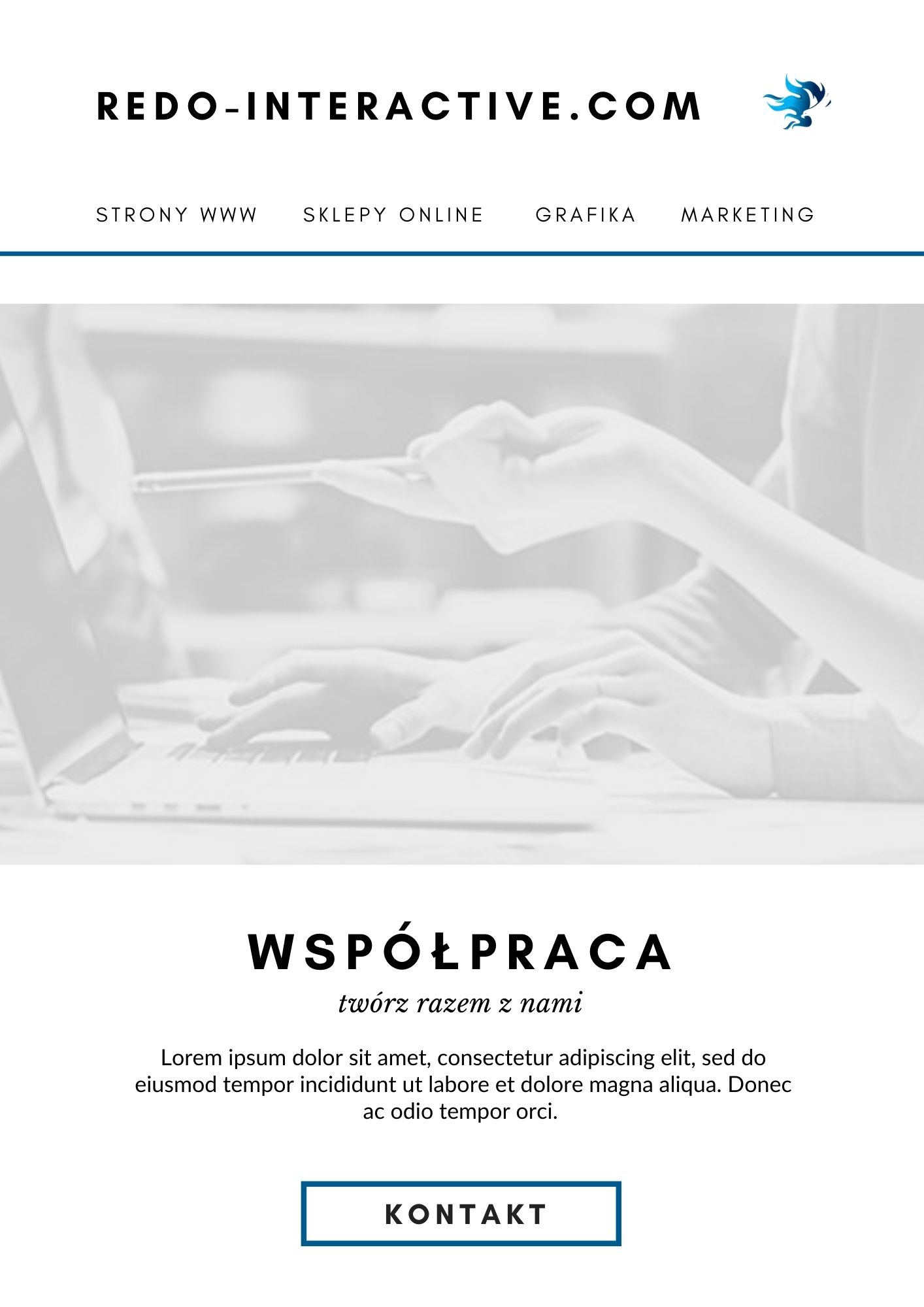
Built newsletter template
With the help of Canva and a slight modification of the ready-made template (changing the colours, content and images) we got our own graphic design of our mailing. Canva is not an ideal tool for this type of projects. Especially in the free version, which we used in this case. Apart from the nice look of our newsletter we also get a few problems to solve:
- The Email Newsletter template in Canva is double-sided – the email marketing template is in two pages while the mailing itself will be a single graphic.
- Lack of project dimensions – unfortunately but Canva does not describe for us in pixels the size of elements or spacing between them.
As you can see nothing is perfect. The best solution here would be a professional program that allows you to define the dimensions of graphics and the ability to constantly check things like spacing between elements or the size of elements in pixels. When we receive a mock-up from a graphic designer in programs such as Adobe XD or Zeplin, we have an insight into all the details of the project such as fonts, spacing and dimensions as soon as we hover over a given element.
A professional project mock-up allows for faster project creation and easier access to the details of graphic elements.
A two-page sample mailing design achieved with Canva:

Newsletter compatible with all email clients – is it possible?
By creating a newsletter, we intend to reach as many recipients as possible and encourage them to click on our advertisement. If the graphics you send are displayed in a way that is incompatible with your design, you risk losing potential customers. It is important to ensure compatibility with all possible email inboxes.
Mailboxes are different and behave in different ways. Coding a newsletter is not a simple matter due to the variety of technical email requirements. Each email service provider has different requirements for HTML and CSS code. This causes problems with the display of the mailing content. For example, the view of the HTML file with our newsletter in a web browser does not reflect the appearance of the file delivered to the email address.
Our message should be thoroughly tested for all mail clients that may be our recipients. Only after the message has been sent and received on a given email account will we know how the email client interprets it.
On Campaign Monitor we have a list of CSS styles and HTML code that behave differently depending on popular email applications (web browser, gmail application, etc.). It should also be mentioned that an application is one thing and a mail client is another (onet, wp, interia etc.). In both cases there may be different requirements for HTML or CSS code.
List of CSS Support Campaign Monitor (click)
Coding a responsive newsletter based on graphic design
I’ve outlined more or less how email boxes interpret the HTML and CSS code provided in different ways. Now we need to think about how to create our newsletter so that it displays properly in all mailboxes. It is also important that this solution is responsive and displays correctly on all resolutions.
Table – a friend of every newsletter
One of the oldest HTML structures – the table – comes to our aid. Mailboxes and e-mail applications have no problem with interpreting views based on tables.
We should make sure that the table structure is based on widths based on %. This will help us to ensure that our mailing is responsive.
It is also worth remembering about the maximum width of the newsletter content. We cannot overdo the maximum width of our mailing, because the recipient may receive incorrectly displayed content. A safe newsletter width will be up to 600px. Regardless of the recipient’s email client, their screen resolution or monitor size – the newsletter should display correctly.
Mailing start code – HTML boilerplate for Newsletter
Below is a sample starter code for our mailing:
1 2 3 4 5 6 7 8 9 10 11 12 13 14 15 16 17 18 19 20 21 22 23 | <!DOCTYPE html> <html lang="pl"> <head> <meta http-equiv="Content-Type" content="text/html; charset=UTF-8" /> <meta name="viewport" content="width=device-width, initial-scale=1" /> <meta http-equiv="X-UA-Compatible" content="IE=edge" /> <title>REDO Interactive Newsletter</title> <style type="text/css"> /* STYLES HERE */ </style> </head> <body style="margin: 0; padding: 0; background-color: #ffffff"> <center> <table width="600" border="0" cellpadding="0" cellspacing="0"> <tr> <td align="center" valign="top"></td> </tr> </table> </center> </body> </html> |
Creating tables and styles for a sample newsletter
Creating the structure of the newsletter and subsequent styling is quite a tedious process and requires a lot of time. All changes that will take place in the code from the starting code can be found at the end of the article in the downloadable file. You can use it and change it in any way you like.
When it comes to creating tables and styles there are plenty of tutorials that help you understand how it works and how to write such code. I can recommend two tutorials from myself:
- Build an HTML Email Template From Scratch (ENG) – learn more about creating tables in a newsletter
- A Complete Guide to the Table Element (ENG) – tips, tricks and basics of creating and styling tables
Fonts in email marketing
Fonts in emails is also a river topic. Importing fonts between the <head> tags in HTML code usually won’t work for mailings. The same goes for importing using the @import style and trying to import inside the <body> tag.
The safest option is to use common fonts that should be available on every computer, in every browser and in every email box.
We choose the most similar font to the font in our project. We check the font in Canva by clicking on the given inscription.
Our fonts are:
- Headers: Glacial Indifference
- Slanted text: Libre Baskerville
- Aparagraphs: Summer
- Click To Action: Glacial Indifference
We are now looking for similar fonts among safe fonts:
- Arial
- Arial Black
- Helvetica
- Tahoma
- Verdana
- Impact
- Times New Roman
- Georgia
- Courier New
- Comic Sans
Now all we need to do is choose a font by appearance that most closely reflects the font from the graphic design. We will not have an exact reproduction of the font but we can get close to the look of the font from the mockup.
In our case, the fonts used in the pre-made Canva template used to create our graphic design are very specific. It will be hard to replicate the fonts from the mockup. If the graphic design of the newsletter was created by a professional graphic designer – this problem would not exist. The graphic designer would take care of choosing the right fonts for our mailing design.
We chose the fonts:
- Arial – dla nagłówków i CTA
- Helvetica – dla akapitów
- Times New Roman, italic – dla tekstu pochylonego
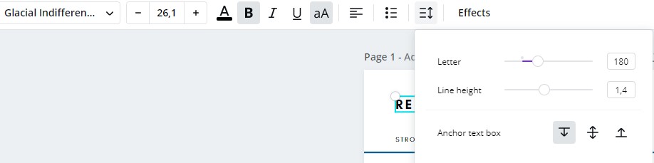
In addition to font selection, font thickness, size and letter spacing are also important. All this can be found in Canva in our graphic design. Just select the text and check its values.
Selected fonts and differences:
The differences are small, but you can see that the texts are different and this affects the whole aesthetics of the design. A particular difference can be seen in the newsletter headlines.
Responsive newsletter – how to do it?
Responsive mailing can be very problematic for a programmer. Mailing can be divided into a view for larger devices (desktop, tablet) and for smaller resolutions – smartphones. This division requires two separate graphic designs and more work.
Responsive does not mean that the mailing has to be divided into two separate views. It means that it should look good on all types of devices. It is known that the more legible the fonts, the larger the graphics and the more adapted the view to the display, the better the impression the recipients will have.
In the case of the mailing used in this tutorial, we did not create a second view for mobile devices. We only created one primary view that will scale for smaller devices. This means that the visibility of the subtitles and images will be a little weaker as with the mobile view.
media queries – programming for a given screen width
The CSS code allows us to adjust the appearance of our newsletter by adapting the code to the width of the screen using so-called media queries.
Unfortunately in case of mailing media queries are not always supported. Some email applications unfortunately do not read the media queries code and it is not possible to use this facility. For example, media queries support does not work for the Outlook application (Outlook 2007-2019, outlook.com).
Despite this, most mail clients should read the media query code and allow us to “refresh” the appearance of our newsletter for mobile devices. How to do this?
It’s easy! Just write a code that will check if a given device has a screen width larger or smaller than the width we indicate and apply the CSS code inside this condition. Example:
1 2 3 4 5 | @media screen and (max-width: 600px) { .small-devices-table { width: 300px; } } |
The example code will only work for devices that are 600px wide or less. If the device is within our condition the .small-devices-table class will set a width of 300px for the element.
There are plenty of tutorials on how to use media queries and I highly recommend reading up on it, as it is an essential tool for building repsonsive views.
How to test and send newsletters
Both for testing and for later commercial use I recommend two sites:
- GetResponse – a Polish service dealing with sending mailings and taking care of all the details related to email marketing. I have tested and used it many times myself. I highly recommend it because of easy and pleasant way of using and also because of great performance.
- Campaign Monitor – also great and worth recommending service dealing with email marketing.
The following pages will suffice:
- create an account,
- create your mailing list,
- upload your newsletter code,
- add relevant images,
- send to previously created mailing list,
Readymade newsletter template to download for free!
If you are curious how our newsletter turned out both in terms of design and functionality – see our newsletter (click).
The source code for the newsletter is also available for download, which you can rework and use in any way you like. You can change content and images and send newsletter to your customers.
DRAFT NEWSLETTER CODE! (click).
Summary
Creating a newsletter to send out is a laborious task and requires a lot of technical knowledge. Not so much the coding as the graphic design of the newsletter turned out to be a big problem. It’s important to have a solid basis for creating a mailing. If you’ve never had contact with creating mailings and graphics before and you’re thinking about email marketing – I recommend turning to professionals. Our team of programmers and graphic designers will allow you to forget about worries with non-working code or incorrect display. We will prepare a project tailored to the needs of your advertisement.